I finished my first season as a gallery artiste recently. I've had several photographs hanging in an art gallery in Door County, Wisconsin since May of this year. A few brave souls even found it within themselves to part with some money to be able to take my work home with them.
The gallery is now closed for the season and it's time to start making plans for next year. I'm refining my black and white digital processing techniques to put a higher level of visual impact in my fine art photos.
Things I've learned so far (and didn't necessarily know going in to my first season as a b&w fine art photog):
Always convert color files to b&w. Yeah, I know digital cameras come with a b&w mode. Don't use it. Why?
Because back in the days of film (you remember those days, don't you?), serious b&w photographers would use color filters to translate what they saw in the chromatic world into an image comprised of shades of gray. They used red filters to darken the sky, yellow or orange filters to play up foliage and green filters to enhance skin tones. Blue filters? I don't know. Maybe if you were shooting someone wearing an Oakland A's uniform. Indoors.
Today, image editing programs like Photoshop allow you to run hundreds (nay, thousands) of possible color filter combinations over your color file before locking it in to b&w. You don't necessarily need to know the difference between what a yellow filter does as opposed to a red or green filter when converting a black and white image -- a couple of adjustment sliders will display an infinite number of variations -- just pick the one that looks good to you and you're good to go.
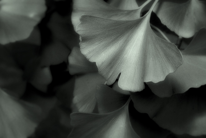
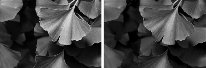
This image of gingko leaves was shot as a color RAW file. In Photoshop, the image was converted to black and white by way of two Hue & Saturation adjustment layers. One changed the color image to b&w, the other acted as the filter that enhanced tones. Below, you can see the difference that filtering makes.
On the left is a straight grayscale conversion of the color image file. On the right is the "filtered" version. The tones across the leaves are smoother and richer and there is more detail in the shadow areas.
I finished the photo at the top of this post by adding a slight Orton effect and then applying a green color filter at 25 percent strength to add a silver gelatin print effect to the image.
Can't wait to have another go at the gallery stuff.
Photographs © 2009 James Jordan.


1 comment:
love the way you caught the character of the ginkgo. Surprised how much I like the gray tones, given that the ginkgo is one of the most brightly hued trees in both its green and yellow phases.
But it is the leaf shape that is so endearing, and you caught that so well.
Post a Comment